ShopDreamUp AI ArtDreamUp

Deviation Actions


Description
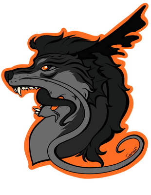
This logo was based off of one of the old logos that the Coyotes used to use before the rebrand (this one as a matter of fact [link]).
The changes I made to the logo were pretty much based on the actual primary. Some of them include adding triangles along the nose, the addition of tan to the head and some changes to the eye.
Lastly, and not to toot my own horn, but for some reason, I actually like this more then the current primary. Maybe because it's less abstract, which is ironic because the original version is heavily so.
![[link]](https://www.deviantart.com/users/outgoing?http://content.sportslogos.net/logos/1/23/full/ukdng0zuarmmsxj75wuwexw8f.gif)
The changes I made to the logo were pretty much based on the actual primary. Some of them include adding triangles along the nose, the addition of tan to the head and some changes to the eye.
Lastly, and not to toot my own horn, but for some reason, I actually like this more then the current primary. Maybe because it's less abstract, which is ironic because the original version is heavily so.
Image size
654x598px 105.2 KB
© 2011 - 2024 PD-Black-Dragon
Comments11
Join the community to add your comment. Already a deviant? Log In
Trevor Tevale would definitely like that